How The Web is Changing – Summer 2015 Edition
Every few months we spend a moment to step back and take a broad look at the web. In a digital landscape that changes so rapidly, it’s important for us to keep tabs on what works, what doesn’t work, and what will work in the future. Investigating upcoming trends and technologies allows us to produce more relevant, longer-lasting products and experiences for our clients. Here are a few key observations from our most recent discussion:
Websites are no longer static properties.
Not long ago, web agencies could be compared to home builders. A business would pay a fee for the construction of a website, then both companies would happily go their separate ways. The truth is this model no longer works. As the web becomes more and more accessible, user interactions have diversified and changed across a ton of different devices. In addition, the web becomes more crowded every day, making search-ability more important than it’s ever been.
As users access the web in new ways (i.e. mobile devices), and competition on the web strengthens, the relationship between businesses and their websites must also change. We’ve observed that the highest performers view their website as an ongoing initiative. The most effective websites serve up new content regularly and adapt frequently. This means more blogging, more adaptability and more accessibility. At Hatchit, we’ve adapted our relationships to best position us for this digital environment by forming long-term partnerships with our clients. This allows us to keep their web properties agile and relevant.
Mobile Is Here. It Should Not Be Ignored.
Most people recognize that mobile web access has exploded over recent years. Around the world (particularly in developing countries), people access the web on mobile devices more often than on notebooks or desktops. The data is abundantly clear:
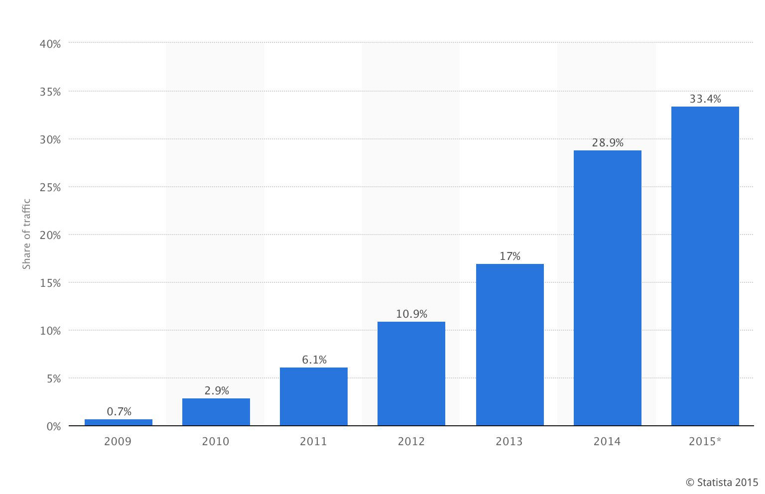 With such strong data, it’s important that we prioritize mobile users throughout the website building process. At Hatchit, every website that we produce is responsive by default. We build and test on mobile devices to ensure that the mobile experience is tailored for the best end user experience.
But maybe it’s not as simple as shifting priority to mobile. A deeper observation comes from our studies on user behavior. Our analytics and user-testing show that users access different websites from different devices. What’s more–users behave differently on different devices too. For example, a user who accesses a restaurant website from their mobile phone may simply want business hours, a phone number or directions. If they went to the same website on their work computer, they may want to browse a menu before lunch.
To conclude, mobile is a huge part of the web landscape, but we should consider user behavior at every access point for every unique project.
Internet Explorer Is Losing.
For an era, Internet Explorer reigned as the most widely used web browser. Today, modern browsers have dethroned “IE” (due largely to the rise of mobile devices). Browsers like Chrome and Safari now account for more than half of web traffic.
Global Browser Usage as of June 2015:
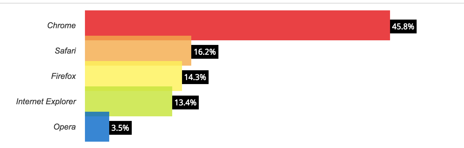

What does this mean? While every project has unique needs – and browser usage should be evaluated and anticipated on an individual basis – for the most part, this means that many websites can now take advantage of emerging technologies and more current practices.
Simplicity is Still King (and a note on enchanted objects).
Simplicity continues to sweep the web as a long-standing trend. A simple and impactful user experience nearly always yields better results than an overbearing and noisy layout. At Hatchit, we’ve incorporated the “less is more” symbol into our logo to remind us that simplicity and ease of use should remain at the forefront of our thinking. We believe in ultimately serving the user with simple decisions that result in a positive result.
When dwelling on this concept, we can’t ignore the emergence of the internet of things. More and more, our daily lives become connected (Fitbit, Nest, Apple Watch…). These enchanted objects will facilitate an entirely new age of the internet – a world in which objects are connected, performing specific tasks all around us. This means a departure from the familiar world of two-dimensional screens. While this trend may not immediately impact our industry today, we are excited about this chapter of the internet becoming a larger part of our business at Hatchit.
What gets you excited about humans and the web? Have you noticed any web trends that we missed? Have questions about any of this? We’d love to hear from you – say hello.
